Looking back at my preliminary task and how far I have come since it, I am much happier with my final piece.

On reflection, I didn't really spend a lot of time on my preliminary task and looking at it now, it clearly shows in the quality of the magazine. I spent a lot longer on my final magazine and was able to create something with a much more professional finish.
One of the most obvious things when looking at my preliminary task and my first drafts for my final magazine was that I wasn't particularly good at using space efficiently which left me with a lot of white space. I realised that this made my magazine look uninviting and unorganised as there wasn't a lot there to appeal to the reader. After creating my first drafts and realising how unattractive it looked I knew that this was something I urgently needed to work on. By bulking everything out significantly there is now minimal, if any, white space on my final pages which makes my magazine look as if it is packed with information, which will make it appealing to a reader.
My preliminary task was essential in helping me get to grips with creating a magazine, as I had nothing created one or anything particularly similar. As I was more a less completely new to the process it really was useful being able to create something low key like a school magazine using new programmes. Another benefit was that when it came round to creating my final task it meant I already knew how to use new technology and so I had more time to spend on using my own design preferences in order to create something unique.
Creating a music magazine is by no means an easy process and so I had to do a lot of research into music genres and top selling magazines so that I could find out exactly what was going to make my magazine stand out against others in the industry. Although I had done research during my prelim task it wasn't as in depth or narrow focused as my final research, so I feel like I didn't benefit from it quite as much as I could have done.
Obviously the main aim for the final task, aside from creating a music magazine, was to create something that would sell. To help me know what I do to achieve this I looked at current popular magazines within my genre, such as Q and Kerrang, and used them as my style models. I found this an advantage as I was able to see what they had in common, what sells and what appealed to me. As I'm part of my own target audience this was a benefit. I feel that although I did look at some school magazines to give me a rough idea I should have done some more in depth analysis of them like I did for my final style models.
I was undecided about who I wanted as my target audience in my prelim task, and attempted to create a magazine that would able to both adults and students. Due to the significant age difference I should have realised at the time that it would be a difficult task. Therefore when it came to choosing a target audience for my music magazine I chose a much more focussed one, with an age range of 16-25. This gave me a lot more leeway, as they would have similar interests and dislikes and so it would be much easier for me to able to appeal to both ends. I chose to appeal to both sexes as well which although, admittedly, I did find a bit daunting at first I think I was able to pull off by not relying heavily on stereotypical colours like blue and pink, which some magazines rely on.
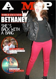
Creating a school magazine wasn't something that I was particularly interested in doing and I think this shows in the overall quality of the piece. This proved to me that when it came to creating my final piece I needed to chose a genre that I either loved or a genre that was completely out of my comfort zone yet would be enjoyable to create. After how boring I found creating my prelim task I realised that it would be best for me to focus my magazine on a genre that I loved. This is why I chose to go with Alternative Rock. Using a genre that I personally love was a major benefit as it allowed me to relate to my target audience on a more personal level as I would be ensuring that the magazine would appeal to me as well.
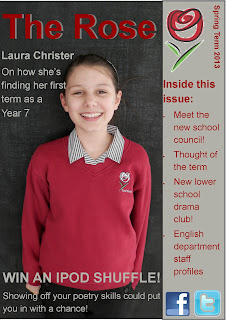
Surprisingly, my favourite page to create was actually the contents page, which I had absolutely dreaded in my prelim. As I had never created a contents page before I was very uneasy as to how to go about it or what it should look like. Therefore in my prelim I created it very quickly and accepted it when I thought it looked vaguely okay. However, by using a style model in my final task I was able to create a much more professional looking contents page which is attractive and I believe will appeal to my target audience. Most importantly I really enjoyed creating it! I loved being able to decide exactly would go in and I think adding the 'Editor's note' was a really fun, personal touch.
I did find it hard to come up with ideas for my final magazine as they are a lot more straightforward for a school magazine. I found with the school magazine that when I did my group research a lot of the elements that they mentioned they would like I had already included in my magazine. This made it difficult to make my magazine unique as I knew everyone else would also have those articles and so it wouldn't really stand out. I'm grateful that when it came to creating a music magazine it was easy to be much more creative. Although I did chose a niche genre and a niche target audience I included elements from the actual Rock genre itself in order to give myself as much leeway as possible to be creative and create something different to the rest.
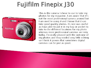
Once I had finished my first drafts I realised that is was still very prelim and that I really needed to up my game if I wanted a magazine that would sell. Perhaps the biggest factor in being able to achieve this was my use of technology. For my main task I decided to use more advanced technology. I relied on the iMac a lot more in my main than I did in my prelim as I realised that Pages created a much more professional looking document than Publisher did. I used my own camera, which I know can take good quality photos, and then used Pixlr to enhance the final images, something I didn't do in my prelim. Technology helped create a very professional looking final piece which I am absolutely thrilled with and still can't quite believe that I managed to do myself!
Once I had finished my first drafts I realised that is was still very prelim and that I really needed to up my game if I wanted a magazine that would sell. Perhaps the biggest factor in being able to achieve this was my use of technology. For my main task I decided to use more advanced technology. I relied on the iMac a lot more in my main than I did in my prelim as I realised that Pages created a much more professional looking document than Publisher did. I used my own camera, which I know can take good quality photos, and then used Pixlr to enhance the final images, something I didn't do in my prelim. Technology helped create a very professional looking final piece which I am absolutely thrilled with and still can't quite believe that I managed to do myself!