The most obvious thing that’s changed since my first draft is my masthead which I added a shadow to in order to make it stand out more against my background photo. I think the use of shadow draws attention to the masthead and therefore the magazine itself. It also gives the magazine a modern vibe which will appeal to the younger end of my target audience. Although I admitted that the house colours of my magazine were bland I decided to keep them the same as after trying out different colour schemes I discovered that they didn’t look right with my background photo and so I chose to stick with the original. I think the colour scheme works as the colours blend well together and don’t clash. It gives the magazine a more sophisticated edge which will help it to appeal to the parental side of my target audience. After doing my focus group research I edited my ‘Inside this issue’ column slightly to include a ‘Thought for the term’ and ‘English department staff profiles’ as these are things that Mr Swain said he would be interested in when looking at a school magazine.
The main improvement that I would make to my front cover would be the colour scheme as although I think it does work well I’m still not too fond of it. To do this I would retake my background photo against a white background so that I could edit it out allowing me to make the background any colour of my choosing which could give me more options for my 3-colour colour scheme.

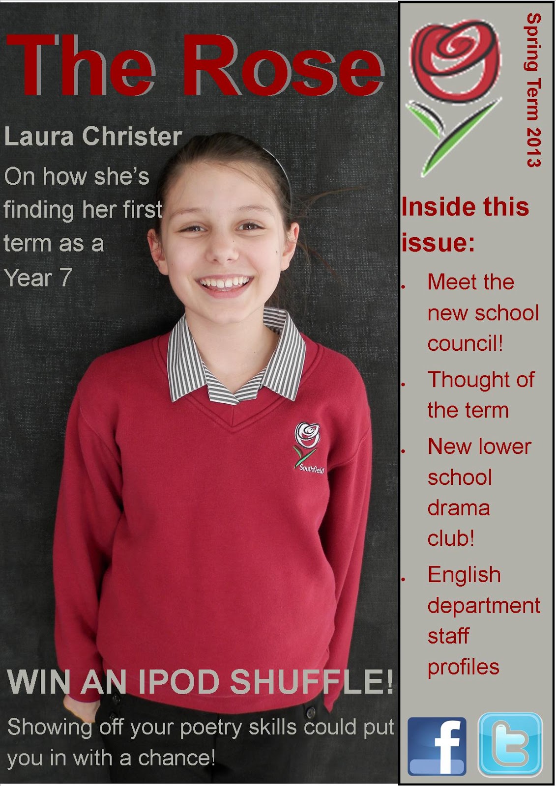
This my final contents page for my school magazine. I made quite a few alterations to my orignal draft in order to make my magazine more appealing. I started by changing my background colour from white to the same shade of grey that is used for the 'Inside this issue' column on the front cover. I feel that this ties the front cover and contents page together and helps to make my magazine look more sophisticated. After carrying out my focus group research I then went on to change some of the articles slightly and changed my language to make it more appealing, such as 'Exclusive Interview with Laura Christer on life in Year 7. I changed the colour of the page numbers to red to make them stand out more and also to fit in with my 3-colour colour scheme. Finally I added an extra photo next to the list of contents so that there is more for the reader to look at and to brighten up the page.
The main improvement that I would make to my contents page is again the colour scheme. As I had already used the grey on my front cover I needed to make sure that my contents page fitted in with the house style and therefore I had to use the same colour. If I had taken my photo against a white background it would have given me a much wider selection of colours to choose from..
Overall I’m happy with the look of my magazine as I think it would appeal to my target audience as it modern and sophisticated and has articles which would appeal to both ends of the spectrum.
No comments:
Post a Comment