Tuesday, 30 April 2013

Final Magazine

I am aware that when you look at my draft magazine compared to my final magazine there is a  huge difference between the two products.


I realised that the minimalistic approach I wanted to take really wasn't appropriate for creating an Alternative Rock magazine as Rock is typically associated with chaos and hectic lifestyles. Also, in order for my magazine to stand out against others and to gain the interest of the reader I couldn't completely dismiss all media conventions. It has proved to me that even by following some conventions you can still make the magazine your own. I haven't used as many conventions as the majority of magazines which allows my magazine to still have a bit of a minimalistic edge as it's not overly cluttered and therefore pleasing to the eye. I've realised that at the end of the day you have a target audience for a reason and you need to ensure that they will buy your product or else it's pretty pointless.
I'm thrilled with my final pieces as I feel they look much more professional and they are definitely something that I would be willing to pick up from the shelf. 
I did panic that I didn't have a lot of time left in which to create my final product as I completely changed my mind nine days before the deadline but I've shown that if you're willing to put the effort in then anything is possible.

Friday, 26 April 2013

Final DPS

This is my final DPS. Overall I am really happy with the improvements I have made since my draft as I feel it looks much more professional and attractive.
I swapped the original photo with the photo that had been on my front cover draft as I think this photo works much better for a DPS. I edited it so that it took up just under 50% of the page, giving me more room to write my article. It looks almost as if the model is walking out of the article and I really like this effect.
I decided to put a heading at the top of my article so that by reading it you know what to expect straight away. It also gives the reader something else to look at instead of breaking straight into the interview.
I added more questions and answers to my interview in order to fill out the white space that I had at the bottom. The fact the article is now full makes it look much more interesting as there is clearly a lot of information about the singer. 
I changed all of the fonts from my draft as I felt that they were too boring. The new fonts work well with my genre and they are much more attractive and appealing to the eye.
I changed the line spacing of the name down the side so that it filled nearly the whole side of the photograph, reducing the amount of space that was left in the draft. Doing this has not only made it stand out more but gives another clear focus for the reader to look at on the page. 
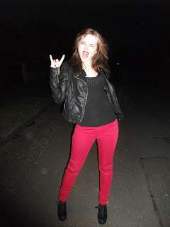
Although I have included my 3-colour colour scheme I changed the shade of red slightly to make it a pinky shade, similar to that of my model's jeans. This makes it easier on the eye instead of having an obvious clash, which, even although something stereotypical of music magazines, is not something that I wanted to do.
I chose to put my heading, her name, and my interview questions in uppercase as these are key things that I wanted to be the main focuses. As well as this having all my text in lowercase would have made my article look quite bland and, as capitals look as though they're shouting, this gives an edgy feel to my article.
I'm really pleased with the final outcome for my DPS, as this is the part of the magazine I was the most worried about creating. I feel that I have been able to portray the rock genre well through my choice of photos, fonts, colours and the actual text itself. 

Final Contents Page

This is my final contents page. Again, it has had significant changes to my draft in order to make it look more like a music magazine.
Although I liked the photo I used in my draft I admit that the edit was very tacky and looked unprofessional. Therefore I simply reverted it back to the original image so that I could use that instead. I placed it in the top left half of the magazine as I wanted the actual contents to be able to run alongside it on the right.
I kept the font the same for my 'contents' as I thought it fitted in well with my genre. I did change the colour though as against the black background of the photo the white looked better than the red. I made the text a larger size so that it would fit inside the border of the photo and look like a part of the photo itself.
I decided to put my 'Issue No.' and 'cover date' on a red column as I felt just black text on a white background as it was on the draft looked a bit bare. I think the sudden splash of colour looks appealing and it helps the text to stand out.
I bulked out my list of contents as I said I was going to and it helps give a sense of a fuller magazine. I split the contents under titled headings so that to the reader it is clear exactly what is going on on each page; for example, on page 21 there is a Muse poster. I made the background of each heading black so that they stand out and it makes my magazine look more organised. I changed the colour of the page number to red to differentiate between the two more easily.
Finally, I added an 'editor's note' at the bottom as it is something personal for the readers. I commented on my favourite parts, or what would be my favourite parts, of the magazine and included a photo so that they get to see the 'face behind the magazine'.
I continued my colour scheme on the contents page as it is part of the house style of the magazine. The background to my contents is white, as compared to black on the front cover, which allowed me to use black more. Although black can be quite a boring colour I feel that I managed to use it correctly, along with the red, to make my contents page as interesting as possible.
I used five different fonts on my contents page and I feel they work really well together. I tried to choose fonts that fitted in with my genre and that were easy to read. I steered clear of heavy graphic fonts as well as fonts that appeared too plain.
I'm really happy with my final contents page. It fits in with the house style I created on my front cover and I feel it looks like a proper magazine. When compared with my draft contents page it is a complete contrast. After looking at my final drafted magazine I realised I really needed to turn it around to make it look as close to professional standard as I could. My contents page was a particular worry as after all, this will be the first thing my reader sees when they open my magazine and so it needs to look appealing.

Final Front Cover

This is my final front cover. As you can see I have more or less completely changed it and I am now incredibly happy with it.
The first thing I did was change the background photo. Now when you look at my magazine it is obvious what music genre it is focussed on. I enlarged the photo and placed her head in between the 'M' and 'P' to give it more of an edge.
I decided to call my magazine 'AMP', short for amplify, as it connotes loud, heavy music which is the main element of rock. It is a short, catchy name and will stick in people's minds. I enlarged the font so that it stands out and will be one of the first things my target audience sees when they pick up the magazine. I edited the character spacing to make it fill the top part of my magazine and having it spaced out adds a new dimension to the cover. I changed the colour of the 'M' to red as it makes it look more appealing and it stops the cover from looking too bland.
The main article of my magazine is to do with my model Bethaney, so it was essential that I put this on the front cover. I put 'World Exclusive' at the top which will automatically grab the readers' attention as by purchasing the magazine they will be receiving an interview that no one else is. My choice of phrase, 'SHE'S BACK WITH A BANG' will entice the reader as the article sounds exciting. I changed the character spacing of the phrase, bringing it closer together, to make it look more interesting and it gives my magazine a bit of a rockier feel.
I added two bursts to my cover to give the reader an insight into what else they can expect from the magazine. They are clearly labelled with the name of the band in the photo and also a short sentence giving the reader an idea of what the article will be about. I chose to put the text in blocks so it makes my magazine look cleaner.
I used six different fonts on my cover to make sure it didn't come across as bland and uninteresting. Although six is a lot of fonts I feel it works well on my cover as they fit in with the genre. For the bursts I kept the fonts the same for both so that it didn't confuse the reader too much. Also, as they are both bursts it would make sense to keep the fonts the same.
I followed a 3 colour colour scheme, using red, white and black, all of which are typically associated with rock. The colours work well on my cover, helping to make it look attractive and exciting. I chose a vibrant red so that it stands out and draws the eye. As the background itself is very dark I chose to stick to white font text for the majority of it so that it can be seen. I used red and white for the blocks to make it look more creative and to make it easier to read.
Overall, I'm thrilled with my front cover. After my draft, a very bad attempt at a minimalistic magazine, I feel that this actually looks like a proper music magazine that you would see available in shops. I think I've managed to tie everything together to give it a professional finish.

Final Image - Extra

After creating my draft for my Front Cover I realised I needed to make several alterations in order to make it more appealing to my target audience. One of these was to add some bursts to give an insight into what else is in the magazine and entice the reader into buying it. I wanted to add two bursts, however, as I only had two photoshoots, I didn't have a third photograph to use.
Therefore, I have decided to use an image that I took at a Don Broco gig in February. I am going to edit it the same as I have with my other final images and this way I will be able to create the two bursts that I want.


After creating my draft for my Contents Page I decided to add an 'Editor's Note' at the bottom as this is what a lot of popular magazines seem to do and I feel that it would work well with my magazine. They all include a picture and, as I'm making a Rock magazine, I kept in with the style and took a photo with a rock pose rather than just plain smiling. I didn't like having a plain background and so I decided to cut the photo out and place the image in front of a mod-rock logo instead which suits my genre and makes the image look a little less boring as well. However, I was pretty stupid and deleted the edit afterwards so I can't put it separately in this post for you to look at, sorry!


Final Image Edits

For my final edits I chose to stick with simple edits as I feel the original photos fit in my genre well enough to enable me to stick to something simplistic. Therefore I simply edited the vibrancy on two of my female model photos, along with my photo of Don Broco to make them brighter and more interesting. I masked a circle onto my Don Broco and The Labels photos so that they would look like bursts on my front cover.


However, when it came to creating the burst for The Labels photo I had to be a bit more creative.


As the photoshoot had been taken in a garden the background wasn't very fitting with the Rock genre. To ensure that it did I needed to change the background. 

I found a backstage photo on the internet and decided to use this. I then cut my original photo out and pasted it onto the new background. The background itself was a very grainy image but this didn't faze me as once I had masked it into a burst it's not noticeable at all. This way my photo now fits in with my genre and style of magazine instead of looking quite so 'boys next door'.


Final Front Cover, Contents Page and DPS

Image Editing

For my drafts I edited the image used on my contents page. This was a straightforward edit in that I cut it out and removed it from the background so that it could go against my plain background. Once I had cut it out I changed the colour vibrancy to make it brighter and more appealing to the eye. Looking back on the edit itself it is rough around the edges and so therefore I am going to tidy it up for my final contents page.


The original photo.

After cutting it out.


The finished edit.


DPS - Draft

This is my DPS draft. Overall I am happy with the layout and the storyline behind my article.
I chose to split the text into two columns as I feel that it looks cleaner when compared to one or three columns. I added the name down the side as it automatically draws attention when a reader comes across the page and they will also know who the article is about straight away. 
My photo takes up just over half of the DPS and is the main focus for a reader when first looking at the page which is what I was aiming for. 
There are still some improvements that I need to make to my DPS. For example my photo needs to be made slightly smaller so that the photo : text ratio is around 50/50. The colours for the article are too plain as I have only used black so I am going to change the colour of the questions so that they stand out more and make it look more interesting. In conjunction with this I'm going to put the questions into bold to, once again, make the article look more interesting. I have a lot of whitespace at the end of the text so I am going to fill it either by adding a callout or by adding more questions.

Contents Page - Draft

This is the draft for my Contents Page. As I went for a minimalistic Front Page I created a minimalistic Contents Page to fit in with the style of the magazine. As with the Front Cover however, I can see that it is too plain and very bland. 

In order to make my Contents Page more appealing there are several things I hope to improve on. I am going to use a different photo of my model as the cut out is rough around the edges and looks unprofessional. I like my choice of fonts but I am going to make the list font smaller and add more to it so that my magazine looks fuller and the size of the font isn't so overwhelming. I'm also going to split it up so that it is clear what each page refers to instead of making the reader have to guess or flick through to find out instead of knowing straight away.
I chose to keep the house colours on the Contents Page as well as it makes the magazine link together well and it keeps my genre running throughout. 


Wednesday, 24 April 2013

Front Cover - Draft

This is my draft for my magazine Front Cover. I wanted to play around with different ideas and so for my draft I went very minimalistic. However, it clearly doesn't work. The cover is far too plain and therefore very uninteresting. This has made me realise that although Ray Gun may have been my personal favourite when I was doing my research in order to fit in with my genre and to ensure it appeals to my target audience I need to focus on making it similar to NME, Q and Kerrang magazine. 
I want to change the colour and font of my masthead. I feel that the shade of red is too dark to work properly with the photograph and so needs to be changed. I feel that I could find a font that fits in better with my genre as well. 
Once I've made these changes I'll be much more confident with my front cover.
I'm happy with my choice of colours as black, white and red work well together and fit in with my Alternative Rock genre. They are colours that catch the attention of the reader and would entice them into buying my magazine.

Saturday, 20 April 2013

Images

I had a second photoshoot with a different model after deciding that my first set of photos weren't right for my magazine. I definitely prefer this set of photos as I feel they fit in with the Alternative Rock genre much better. Below are my favourites and I am going to test them out on my magazine to decide which look best.


Wednesday, 17 April 2013

Health and Safety - Take Two

For my second set of photos my locations are a street and a road. The photos are going to be taken later in the evening as it is beginning to get dark. Therefore I need to take some things into consideration.
As it is going to be darker I need to be careful that my model doesn't trip over a kerb and injure herself because she can't see where she is going. I also need to be aware of things such as uneven paving stones.
As for the road it's pretty self-explanatory. I need to make sure that the road is clear when I am taking my photos and that I am not near any corners that cars could speed round, resulting in them hitting myself or my model.
So long as I keep an eye out and ensure we are both sensible there should be no problems and I should be able to achieve some pretty impressive photos.

Idea Change!

So, with only 9 days to go until my deadline I've decided to completely change my idea! When it came to sitting down and beginning to create my magazine I've realised that the photos I've taken are in no way related to Alternative/Indie Rock. They're much more Indie singer/songwriter which is not the genre I set out with in mind. 
After having a bit of a rethink I've arranged to meet up with a different model to take photos on Friday. I've chosen a better location this time round and I am positive that my photos will fit into the Alternative/Indie Rock genre, brinking on more alternative if anything. 
I realise that I really don't have a lot of time left, especially as I have to make a first draft of everything along with my finished pieces and evaluation but I know that if I make myself a plan and stick to it, it will all be finished by the 26th.
I've had a lot of ideas so I'm very excited about Friday and seeing how everything turns out!

Tuesday, 16 April 2013

Original Photos

I set up a photoshoot with 2 models in which I took both staged and spontaneous photos. For some of the spontaneous photos I set my camera to take photos every 10 seconds and then left them by themselves for 5 minutes. This resulted in some very natural looking photos that I am proud of. For the others I simply took them as they were playing. Although I do find some photos stand out to me in particular I need to know how they will look on my magazine as obviously some will look better than others.


Health and Safety

Before I can take my photos I need to take into consideration the possible risks of my chosen locations. The two locations I have decided on are a garden and a conservatory. 
The conservatory isn't empty and contains  tables, chairs and a TV, so even though we will move some of it to the side we will still have to be careful not to fall into anything and run the risk of breaking it. It also has a tiled floor which is something we have to take into consideration, especially as we are using balloons, as it would be easy for one of my models to fall and injure themselves.
There aren't really any major risks in the garden as it isn't particularly hard ground so it wouldn't injure anyone if they fell. The only real factor I have to take into consideration is the weather, as if it rained I would be unable to take my photos and the ground would be too muddy afterwards for me to take them as well.

Front Cover - Rough Draft


This is the rough draft for my magazine front cover. I used a photo of the band Don Broco as I haven't taken my own photos yet and they are a band who fit into my chosen genre.
I chose to stick to a 3-colour colour scheme as I feel that it makes the magazine look more clean cut. I chose to use black, white and red as they are colours that work well together. The red makes the text stand out, therefore drawing attention towards the magazine.
I haven't chosen a name or tagline for my magazine yet. In order to give me an idea of spacing on the cover I needed something to fill the gaps so I chose to simply put 'Masthead' and 'Tagline'. This then gave me something to work with and work around.
The callout "We're not your average band" is not in the font I wanted to use as during the changeover from a document into a photo form to be uploaded the font didn't sync properly and therefore changed. I chose to use this sentence for my callout as I believe that it is interesting and will make the reader query what is being asked in the interview in order to receive that response, so they will want to buy my magazine.
I also changed the character and line spacing of my text. I changed the character spacing by bringing the callout text closer together and spaced out my masthead and tagline to fill the space they were in. I then went on to adjust the line spacing and bring the band name, "Don Broco", closer to the quote in the callout. I feel that this has given the magazine a new dimension as it has made it different and more interesting to the eye and therefore it would stand out against other magazines.
I hope my magazine's overall look will achieve a combination of Q magazine and Ray Gun. Although originally I wanted to base it on Q magazine, after deconstructing Ray Gun I was attracted to its simplistic style. I aim to use elements such as a callout and sharper colour scheme which would commonly be found in Q magazine and then mix them with Ray Gun's very simplistic, basic style to give my magazine a clean finish with a bit of an edge.

Circulation

According to the pressgazette website supermarket magazines are dominating the top 10. This could be down to the fact that they are free and easily accessible. They are also filled with information on things for the family and low-budget meals and days out which will appeal to people during a recession and is something which people are beginning to take more of an interest in. 

"ASDA" magazine is the highest selling magazine with a circulation of 1,963,201. 


The lowest selling magazine is "Homes & Interiors Scotland", with a circulation of only 10,345. This could be because it is aimed at a more niche target audience as it only applies to those who live in Scotland.


Sparkle World magazine has a circulation of 78,816. It is aimed at the younger generation, around 7-11 year old girls. It is released fortnightly and is filled with stories, activities and games, the majority of which are related to fairies, ponies and animals. It also comes with a variety of different freebies and includes several competitions. The magazine's circulation has increased by 20.7%, this may be due to its vast appeal to younger girls, which is becoming a larger target audience.